
Written by Julien Ricciarelli-Bonnal
15 August 2026
The Essentials
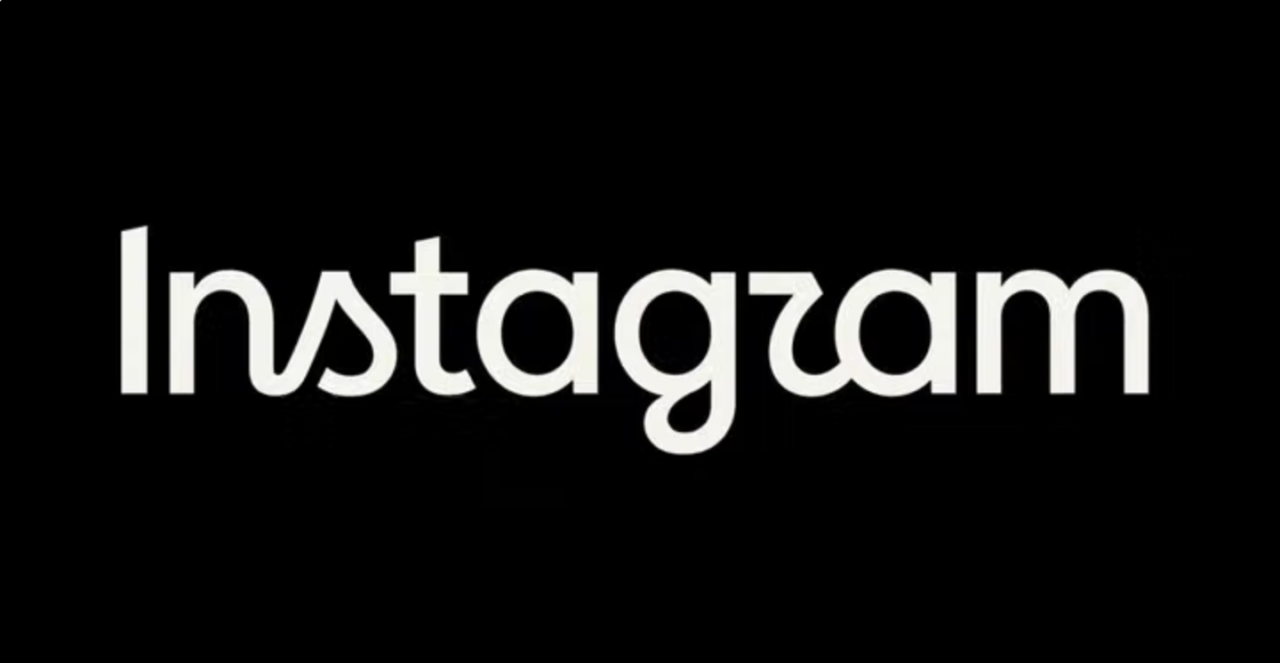
Instagram has changed its wordmark for the first time since 2016. The familiar handwritten name has been redesigned with a cleaner, more modern style intended to better fit the platform’s current identity. The problem is that part of the internet now reads “Instagzam” instead of Instagram, mainly because of the shape of some of the letters. The reaction is immediate, funny and obviously disproportionate, but it highlights something important for brands: once a visual identity becomes extremely familiar, even a minor change stops being a simple design decision. It affects a symbol that the public increasingly feels it partly owns.
Changing a logo should be a relatively simple operation. A company redraws a few shapes, modernises a typeface, adjusts the visual balance and then launches the new identity. In reality, the more famous the brand becomes, the less control it retains over the way that change will be received.
Instagram is experiencing exactly that. The platform has unveiled a new wordmark, the written “Instagram” logo, which had not undergone a major redesign since 2016. The colourful app icon that everyone recognises on their phone remains in place; what has changed most visibly is the brand’s typographic signature.
Instagram wanted something more modern and cleaner while preserving part of the handwritten character of the previous identity. Designers explored multiple directions before returning to an approach that remained recognisably connected to the existing brand.
The internet, however, noticed something else: “Instagzam”.
A Small Change Is Enough When Billions of People Know the Logo
At first glance, the redesign is hardly revolutionary. Instagram is not replacing its visual identity with something completely unfamiliar, nor is it repeating the dramatic shift of 2016, when the old camera icon was replaced by the colourful square we now recognise instantly.
The new lettering keeps part of the handwritten spirit, but some letters are tighter and more upright. That closeness between old and new is exactly what makes the reaction interesting: the public knows the previous signature well enough to notice changes that would barely register if they belonged to a lesser-known brand.
And when a visual element is seen billions of times, legibility stops being a question reserved for designers. Some users quickly began reading “Instagzam”, others saw “Instagwam”, while jokes spread around the shape of the “r”. Within hours, the new identity was being discussed less for its design intentions than for the accidental word people thought they could see.
It sounds trivial, but it shows how familiarity becomes a constraint. A company may legally own its logo, yet culturally that logo also belongs, at least partly, to everyone who sees it every day.
The Internet Never Judges a Rebrand Like an Art Director
Teams working on visual identity think about consistency, typography, digital usage, legibility across formats and whether a graphic system can remain effective for several years. Ordinary users often operate with a much simpler test: “this looks weird”.
That gap explains why reactions to logo changes are so predictable. A company can spend months refining an identity that feels coherent internally, only to discover that the public thinks it resembles a detergent brand, that one letter looks like another or that people simply preferred what they already knew.
Instagram is familiar with this dynamic. Its 2016 redesign also generated intense negative reactions at launch, yet the colourful icon has since become one of the most recognisable symbols in the digital world. Ten years later, what was once described as a visual disaster feels so normal that it is difficult to imagine the platform without it.
Initial backlash is therefore not necessarily a long-term verdict. A logo can be mocked for a few days and then become completely ordinary once hundreds of millions of people start seeing it every morning.
The new logo may not need to be loved today. It probably only needs to become familiar tomorrow.
The Problem Starts When the Public Finds a Meaning the Brand Never Intended
The “Instagzam” situation nevertheless reveals a particular difficulty: once the internet has identified something in an image, it becomes surprisingly hard to stop seeing it. The same mechanism powers visual illusions, but it also explains why brand identities are so easily transformed into memes and jokes.
A designer can spend hours explaining why a curve was adjusted, but if thousands of users decide that it looks like a “z”, the discussion immediately changes. The official meaning of the identity begins competing with a meaning produced spontaneously by the audience.
That kind of appropriation is now part of the cultural life of major platforms. Their logos, names, interfaces and even their bugs become material for memes, commentary and reinterpretation. The more tightly a brand tries to control its image, the more likely it is to discover that part of that image becomes uncontrollable once enough people recognise it.
Instagram is not necessarily suffering from this situation either. The controversy is generating substantial attention for what would otherwise have been a fairly technical typographic update, probably discussed mostly by designers and branding specialists. Millions of people are now discovering the new wordmark precisely because others think it looks wrong.
From a pure visibility perspective, “Instagzam” may already be an unexpectedly effective launch campaign.
A Rebrand Is No Longer Presented. It Is Immediately Dissected
Brands once had more control over how a new identity was introduced. A press release, an advertising campaign, a few explanations from the creative director and perhaps a media presentation allowed the company to establish its own narrative before the public took over.
Social media has reversed that sequence. The logo appears, someone shares a screenshot, another person makes a joke and the conversation may already be underway before the company has finished explaining what it was trying to achieve. The brand launches an identity while the internet simultaneously launches its own version of the story.
That forces a certain level of humility on companies working on their image. It is obviously necessary to test an identity, check its legibility and anticipate the most likely interpretations, but no study can predict every reading that a global audience may invent within a few hours.
This is particularly true for companies whose identities are already extremely strong. The more recognisable the symbol, the more intensely any modification will be compared with what came before, dissected and turned into a collective debate.
To evolve a brand identity without losing what makes it instantly recognisable, the real challenge is therefore not to eliminate every negative reaction, but to distinguish between the natural resistance to change and a genuine perception problem.
Instagram Probably Already Knows Everyone Will Forget “Instagzam”
There is a good chance that the current controversy will feel far less important in a few months. The 2016 precedent should make Instagram particularly relaxed about this: people can hate a visual change when it launches and then absorb it so completely that the old version eventually starts to look dated.
The only real question is whether the reading problem disappears with familiarity. If the brain quickly starts recognising “Instagram” without hesitation, “Instagzam” will probably remain a launch joke. If the confusion persists, the company can always adjust a few shapes quietly, as brands regularly do without announcing another major redesign.
But the most interesting point may be elsewhere. Instagram has just reminded us that a globally recognised brand no longer needs to transform its identity dramatically to trigger a worldwide conversation. A few slightly different letters are enough.
While designers explain the modernisation of the graphic system, the internet looks at an “r”, sees a “z” and instantly invents a new name for one of the best-known platforms in the world.
For Instagram, this is probably not the disaster some people are suggesting. For “Instagzam”, on the other hand, the career is off to a strong start.
We support companies that want to evolve their identity and communication without losing the recognition they have built with their audience.
Written by Julien Ricciarelli-Bonnal
15 August 2026